
Pad Lock
Project Overview
Role
User Researcher, Interaction Designer, Visual Designer
Client
Undergrad
Time
3 Months
Pad Lock is a home automation app that allows users to remotely control a deadbolt. This app is made to specifically address the needs of Airbnb host while still being useful to general homeowners.
I undertook the project to refine my UX research skills, iOS guidelines compliance, and balance both user goals and business goals.
Context and Competition
The most important thing to know when making a product is the market. I began my research by analyzing all the major smart lock companies. I focused on features, maintenance, user feedback, and sales. I expanded my investigation by reading the documentation on Apple's HomeKit and Humane Design. Once I built an understanding of home automation, I gathered my questions and began talking to users about it.

Problems and Pain Points
Several issues can arise when using a smart lock. But it doesn't get much worse than being locked out. I read various stories of this occurring, and they all involved a smart lock with dead batteries. Dead phone batteries and connectivity issues could also leave someone stranded outside of their home or Airbnb. These issues were addressed in the final design by creating guest pin codes, still allowing key entry and giving current detailed information about lock batteries with high visibility.
There are a lot of smart locks on the market. There are a few that integrate with Airbnb making it a huge advantage. Finding ways to use Airbnb data in tandem with Pad Lock to create a seamless experience was a high priority goal. Allowing guest permissions to be easily altered is important in case there is a change in plans for the tenant.
Understanding The User
I conducted a series of open-ended interviews to better understand potential users. I interviewed homeowners who own smart devices and those who were considering buying them. I learned that, though locks are for security, people buy smart locks for convenience and that the appearance of a lock will heavily influence if someone purchases it. A smart lock is a luxury product, and the app should reflect it.
My research led me to consider Airbnb owners to be the ideal user. They had the greatest incentive to purchase a smart lock and were likely to buy more than one. I wasn't able to secure an interview with an Airbnb owner, so I relied on a series of blogs and online reviews to understand how Airbnb owners use smart locks.
Our Users
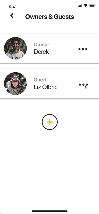
My research and demographics information helped me to construct the archetype of my primary and secondary users. I chose Derek, an Airbnb owner, to be my primary user. I prioritized the features and workflow that best suited Derek, while still ensuring users like Alma could still use Pad Lock.
I used Derek and Alma as models during the design and testing process. When thinking of what features to implement and how best to implement them, I referred to these models for validation.

Primary
Name
Derek
Age
28
Occupation
Research Assistant
Derek owns an Airbnb on the other side of town. He is typically busy doing research on campus, so if his guests change plans, it takes a lot of time out of his day.

Secondary
Name
Arron
Age
35
Occupation
Consultant
Alma recently moved into a new town with her son. She is concerned about security and feels safe when she knows her son comes home from school.
Top Tasks
After defining the requirements, all the features that would be present in the app, I prioritized which features would be used most frequently by my primary persona. I narrowed this list down to five and designed screens that would facilitate these interactions with the least amount of steps.

Wireflow
Once the most important screens were conceptualized, I began considering how they would interact with one another. I created a wire flow of low fidelity screens that would guide my creating of the high fidelity versions.

Visual Design
At this point in the project, my app didn’t have a name. I created a list of words associated with homes or locking mechanisms, words like bolt or dwelling. I landed on the word padlock and designed a logo that illustrated the play on words. The logo served as the catalyst for the UI visual design.


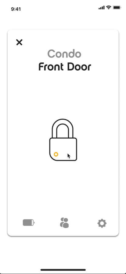
Lock vs Unlocked
While evaluating the competition; I encounter various methods to show the status of a lock, whether it was locked or not.
Some used color which can cause issues for the color blind or the new users who might not know what the color represents. I decided to use the shackle of a lock to indicate this which is a more universal symbol.

Unlocked
Locked
Screen Layouts
With the visual design established, I went through the process of designing the screens. The primary layout is for an iPhone X and was created in Sketch.


Prototyping
I imported the screens into InVision Studio where I created the interactions. I chose to use InVision to learn more about the program. Ultimately, InVision lacked some features I wanted for user testing, but it was worth it to familiarize myself with its collaboration tools.

Testing and Refinement
After implementing all the proposed features into the prototype, I presented my work to my peers and began paling for usability testing.
Expert Review
I decided to do an expert review instead of a standard usability test. I had people with experience in usability walk through my app twice. Once while keeping in mind my primary user voicing questions and feelings they might have; and a second time as themselves, identifying any usability problems they were able to uncover. The problems they were looking for were from a categorized list of 10 usability heuristics and their own experiences.
Findings
The Expert Review uncovered several usability problems with the prototype. I totaled 15 significant changes after testing was complete, these are some of them.
Lock Activity
Seeing a history of who is coming and going from a home is a key feature of Pad Lock; however, the reviews had difficulty finding this information. This was the most pressing issue I uncovered during testing.
I changed the design of the guest list to lead directly to that individual guest’s history. In hindsight, the problem could have been avoided by conducting a card sort earlier in the prototyping process.
Icon Design
I updated the design of several icons making them more universal and conventional. Clarity is crucial because the icons were not supported by text.
Readability and Wording
Pad Lock’s typeface, Chalet-NewYorkNinteenSeventy, can be awkward to read. I initially used it for headings but ultimately tempered its use. Chalet is now only used for Pad Lock’s name and user named locks and groups.
Terms like account and scheduling were altered in the final version based on feedback.
Reflection
Pad Lock was the first Goal-Directed design project that I did entirely independently. It was great having the freedom to focus on solving the interaction design problems that I found most interesting. I also got a chance to try out some interaction design processes for the first time, like top tasks and expert reivew. Working alone, I learned that it's best to test your ideas as early as possible, even if it's just a paper version.