
AR
Measure Kit
Project Overview
Role
Project Lead, Usability Moderator
Client
Undergrad
Time
2 Months
I led a team conducting a usability study for the app AR Measure Kit. AR Measure Kit is an iOS application that uses augmented reality to measure real-world objects.
My team created and conducted a series of test to evaluate the usability of AR Measure Kit. After testing, my team ranked usability issues by priority, recommended solutions, and presented our findings.
The Pitch
On the outset, I was interested in augmented reality technology. Apple had recently released AR Kit, a development tool that would simplify developing AR experiences for iOS. At the time, there were no publicly available best practices or guidelines for AR usability.
I got my team's approval by emphasizing that augmented reality will inevitably cause usability problems that have never been encountered; we had an opportunity to influence the use of AR in future applications. I proposed that we test the app, AR Measure Kit. AR Measure Kit was chosen because it's not an entertainment app but a utility, therefore, usability recommendations could potentially affect a wide range of AR apps.
Methods
MEELS
MEELS stands for memorability, errors, efficiency, learnability, and satisfaction. We created a list of tasks that would test memorability, errors, efficiency, and learnability. Satisfaction was measured by Product Reaction Cards and the System Usability Scale. By dividing the user experience into these five sections, we were able to identify the app’s major strengths and opportunities.
System Usability Scale
The SUS is a short Likert questionnaire. The questions are not observed individually but calculated to generate a score that determines whether or not a product is usable. Users took the SUS after the PRC as not to prime the uses for specific words that were in both tests.
Think Aloud Protocol
During usability testing, we encouraged our participants to think aloud. Explaining their intention, expectation, reaction and rational while using the app. During testing, participants might go silent, so we also developed a list of “neutral prods” to get the user talking again.
Product Reaction Cards
PRC is a post-test survey method designed to get qualitative feedback. 118 cards with descriptive words written on them are shuffled and spread out onto a large table. Participants select five cards that best describe their experience and are asked to explain their selections. We used the PRC to gauge user satisfaction.
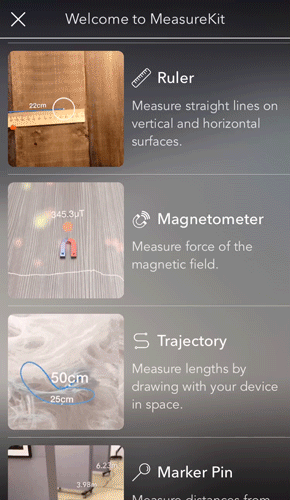
Ruler
Level
Angle
Cube
Tasks
I served as moderator during the usability test, guiding participants through the five tasks. Tasks involved participants selecting a measurement tool and using it to complete a specific activity within the testing space.
We chose only tools that used AR. On the fifth task, users would repeat the first task to test memorability.
Live Testings
I moderated all five of the usability test sessions. As the moderator, I was the main person to interact with the participants, explaining the testing procedure, administering consent forms and guiding the users through the tasks. My most crucial role was maintaining the think-aloud protocol. I used techniques to ask the participants follow-up questions and keep them talking without biasing their responses.
We recorded the test from three perspectives. We used screen capture software to record the app and the participant's voice. One camera captured the participant's expression; the other was used to record body language.
The other three members of the team took notes, ensure that the recording equipment was functional, timed and documented the results of tasks, and administered post-test questionnaires.

Questionnaire Results
One of my team members administered the Product Reaction Cards and System Usability Scale tests. They asked followup questions so that participants could explain the meaning behind their card selections. The PRC and SUS were conducted in a different area and away from myself to avoid acquiescence bias.
System Usability Scale
58
AR Measure Kit received a score of 58, which is below the average or 68 for digital products. This means that the app had significant usability problems.
Product Reaction Cards
66% Positive
While users were impressed with the technology of the app, selecting words like cutting edge, novel and innovative, they experienced frustrations while using it, choosing cards like unpredictable, uncontrollable, fragile, and hard to use.
Participants saw value in the idea and purpose of the app, saying it was helpful, convenient, useful and timesaving, but, they didn’t find it usable, selecting the cards annoying, confusing, too technical.
Initial Findings

During testing, we uncovered recurring issues that caused the majority of usability problems.
Difficult Surfaces
AR Measure Kit had issues detecting surfaces with little texture or features (whiteboards, smooth surfaces, reflective surfaces, etc.)
In App Guidance
Every participant had trouble getting accurate measurements. The app gives the user feedback about accuracy by identifying surfaces and detecting points, but only one participant understood the feedback and found it useful.
Increasing Accuracy
Every participant had trouble getting accurate measurements. The app gives the user feedback about accuracy by identifying surfaces and detecting points, but only one participant understood the feedback and found it useful.
Recommendations
When it comes to memorability and efficiency, AR Measure Kit performed well. Its opportunities were in learnability, errors, and satisfaction. My team and I presented these six recommendations which are ranked by priority.
1
Use Video To Teach The User
AR Measure Kit contains 2 to 3-second video clips that show a user’s screen while using a tool as expected. These clips are shown when the user first opens the app and again if the user goes to the tool selection screen and taps the help icon.
These videos fail to teach because the app has 9 tools and front-loading all the learning isn’t effective. The user is unsure of what is relevant. During testing, none of our participants discovered the video in the tool selection screen.
Solution
Play the short video when the user opens a tool for the first time. After it plays, have the video minimize into the help icon.
2
Increase Visibility of Hint Section
The Hint Section is a persistent bar of text that guides the users while using a tool. During testing, only 2 of the 5 participants noticed the hint section. These users scored higher than average on the SUS and selected mainly positive PRC's.
Not noticing the hint is likely a result of “Banner Blindness,” a habit where users subconsciously ignore content at the top of web pages because it’s likely an advertisement.
Solution
Increase text size of the hints and raise the opacity of the gradient background. This will create more contrast and higher visibility.

Original

Higher Visibility
3
Restrict Measuring
When Accuracy is Low
The hint section would tell the user to tap an area to measure it even when the app had not detected a plane. This caused the measurements to become more erratic.
Solution
Use the hint to explain how to increase accuracy until enough area has been detected. It should say how far away from an object the user should be and to move the camera forward and backward to scan the area.
4
Warn Users About
Difficult Surfaces
Some surfaces simply don’t work with this technology. Walls with little texture and variation are difficult to measure and reflective surfaces can’t be easily detected. Every user had issues measuring angles on whiteboards and using the level tool on walls because of this.
Solution
Include which surfaces are impractical to measure in the tool’s help section
5
Identify The Meaning of Feedback
The hexagonal surfaces were the best indication of accurate measurements but only participant 1 figured out what it meant. Participants often noticed the hexagonal surface well after it appeared because of its subtle gray color.
Solution
The hint should say “plane detected” when that app identifies a surface. The hexagons should first appear white and fade to gray. This appearance and transition will make the hexagonal plane more noticeable.
6
Lead Users to That "Wow" Moment
There was one thing that happened during testing that got participants excited about the product. When a participant placed an AR object, the angle tool or the cube, in the environment and circled around it. After experiencing that the app was not just measuring objects but adding objects into the world they reacted very positively. This “wow moment” happened with participant 1 and participant 4, the only participants which gave the app a passing SUS score.
Solution
When the user selects the angle or level tool for the first time play the short video clip of how to use the tool. In the example video, have the user circling around the AR object. This should encourage the user to do the same.
Reflection
A few months after our test Apple added an AR measuring app to iOS. This app is very similar to AR Measure kit. It was telling to see that some of our recommendations for AR Measure Kit, such as increasing the visibility to hits and not instructions users to measure when accuracy is low, were present in Apple’s measurement app.
This was my first experience leading a team to conduct a usability study. My take ways were about getting buy-in from teammates, ensuring that major decisions are collaborative. This project gave me new insight in constructing tests in a way that minimizes bias and how to effectively moderate usability studies.